
Silicon Valley Technology Commentary & Archives · Est. 2006 3,045 Posts · 2006–2026
Showing posts with label Netbook (2 posts). Show all posts

July 4, 2009

July 4, 2009 · 3 MIN READ · BY LOUIS GRAY

Arrington Betting Big On the CrunchPad Mobile Device

Arrington Betting Big On the CrunchPad Mobile Device

While many things have been written and said about TechCrunch's Michael Arrington since he debuted his technology blog network four years ago, he is without a doubt a risk taker. The pending launch of the eagerly awaited CrunchPad device could possibly do more to define his legacy than almost any other challenge he has taken on. Not content to having one of the most visible and influential technology sites on the Web, Arrington looks to be charging head-first into an extremely competitive field of consumer electronics, an area that will cost considerable investment of both time and money. If the CrunchPad is a success, the way we consume the Internet on the go could be forever changed. And if it is not, the device will join the ranks of many that have charged up the hill before it and fallen short.

Arrington's trait of a risk taker is one that has helped make him very successful, pushing his blog to near mainstream acceptance, competing against publications with history marked in centuries. And now, the story of the CrunchPad, so far, is one of his trying to develop a product that was a solution to a problem no consumer electronics hardware developer has yet done well - introducing a device whose sole purpose is to help browse the Web on the go. No hard drive. No phone calls. No keyboard. As he told the New York Times yesterday, the device's focus will help it avoid the slowness of other netbooks that are often impacted by other applications. And he doesn't see the device being eclipsed by the long-rumored tablet that Apple may or may not ever introduce.
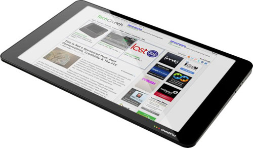

An Early Prototype Image of the CrunchPad (via TechCrunch.com)

Early photos and short video clips of CrunchPad prototypes have not only made the device look real, but extremely inviting. On my first visit to TechCrunch's new headquarters in Palo Alto in April (See: Super Geek Spotted at TechCrunch HQ On a Segway), I saw the CrunchPad being worked on, but at Mike's request, did not take pictures of it or blog about it myself. As he was host, I obliged, of course.

But my interaction with the CrunchPad prototype was strictly visual. I didn't pick it up. I didn't turn it on. And I certainly didn't get to compare it to my laptop or my iPhone to see how it fared. And therein lies the real question of whether the CrunchPad has a home in my fast-growing gadget pile. I love the idea, but wonder just when would I need to have a CrunchPad along with me, either instead of the laptop or instead of the iPhone. The MacBook Pro is clearly my workhorse, and the iPhone is great for browsing quick clips on the go. The CrunchPad, a 3rd device, sits in between - a great looking device that I might pick up when I don't need to use any Office applications, but to instead just take in the Web.

The pricing of the CrunchPad, at a rumored $300, is about the same for an iPod or iPhone, and at the low end for some of today's underfeatured, ugly, netbooks. $300 is an aggressive price point that would make it practically impossible for me to make good excuses not to buy one, even if just to hit those "in between" scenarios where my laptop or iPhone would not fit the bill.

Coverage of the CrunchPad's continued development states that news will arrive by the beginning of August, and that the tablet will soon be available for purchase, giving Mike back the hours he would otherwise be spending blogging, as he looks to turn over day to day management of the product.

December 19, 2008

December 19, 2008 · 4 MIN READ · BY LOUIS GRAY

You Can't Afford to Lose Mobile Readers

You Can't Afford to Lose Mobile Readers

By Daniel J. Pritchett of Sharing at Work (FriendFeed/Twitter)

The continued market growth of iPhones, Netbooks, Blackberries and other tools make mobile browser support more and more important.  Here’s a quick thought experiment for you: If you’re running site analytics, look and see how many of your viewers run a resolution lower than 800x600.  Nearly 6% of all visitors to this site are using these low-resolution devices.  Most of them are using the 320x396 screen of the iPhone and iPod touch family.

Respected publisher and all-around media thinker Tim O’Reilly insists that the tipping point has come:  “… if we're trying to get ahead of the curve, we need to think first about the phone, and then think about the PC browser experience as the add-on.”  Google blogger Matt Cutts succinctly demonstrates the worst-case scenario in mobile browsing:  If you’ve got a flash-only site, those iPhone users are just going to surf around you without a second thought.  Can you afford to lose them?  Not for long.How your site could be frustrating mobile usersGreat, so you’re now committed to making your site as mobile friendly as possible!  You’ll need to understand some common frustrations mobile users encounter when viewing sites and how to deal with them.  I’ll list the ones I’ve picked up in my years of browsing on handheld devices:

Load time:  Many contemporary blogs include third-party (such as this site and my own) include sidebar widgets, third party commenting systems, animated subscriber counts, and plenty of other things that load off-site.  You’re also likely to see an image or three in every post because images are known to increase user interest in reading posts.

Readability: Pile all of the widgets into a layout that’s designed to be read at 1024x768 or higher and you’ll find that you’re seriously taxing the bandwidth and processing power of the average mobile phone.

Navigation: Each mobile device has its own sacrifices in terms of navigation.  The iPhone’s multitouch screen makes zooming and resizing easy but iPhone users sorely miss a real live tactile keyboard.  You won’t find many iPhone/iPod users willing to type out more than a few lines at a time.  Other phones like the T-Mobile G1 have real keyboards but no multitouch.  The lowest common denominator of phones (that are going to be browsing at all) is probably something like my Motorola RAZR.  The RAZR lets me flip through lo-fi pages using the equivalent of a five-key keyboard: up, down, left, right, enter.Start making your blog mobile friendly today!If you’re here to learn how to make your blog more mobile friendly, you’re in luck.  The relatively simple format of most blogs – one post at a time in chronological order – lends itself well to the task of adding a mobile layout.  Here are a few of the more common blogging platforms and tips on how to “mobile-ize” them:
  • WordPress has a series of plugins that will ease the process for you.  I use MobilePress and WPTouch.  Beware that you’ll have trouble integrating WPTouch alongside the popular WP Super Cache plugin. 
  • Blogger doesn’t have the plugin architecture WordPress does, so you’ll have to either work a lot harder or settle for less in terms of mobile supoport.  Intersquash will “iPhoneize” any site that has an RSS feed at no charge.  Here’s the Intersquashed iPhone-friendly version of LouisGray.com:  You’ll notice that Intersquash shows only the latest items on a feed.  This won’t help a mobile reader who comes to your site looking for an older article. 
  • Tumblr has a dead-simple “mobile” feature – access it by adding “/mobile” to the end of your tumblog’s URL.  Check out the mobile view on Fred Wilson’s tumblog for a nice example.  The only complaint I have about Tumblr’s mobile support is that it strips out any customization you’ve done, such as adding the ability to comment on your posts via DISQUS or IntenseDebate.
Where should we go next? Now that we’ve started on the road towards making our sites more mobile friendly, let’s plan out our next steps.  At my blog I’ve noticed that the MobilePress and WPTouch themes put a great face on my posts, but they ignore a lot of my favorite user convenience features.  My “Share this” widget and the “related posts you might enjoy” plug-in don’t appear for mobile browsers.  It would be great to get more of these features supported by the mobile “face” of our sites.  Maybe I can track down the authors of some of these plug-ins and see what we can do!

Perhaps more important is the question of providing accessibility to the disabled.  How easily will blind or deaf visitors be able to read your content and navigate your site?  They’ll likely come armed with a few tools of their own to aid them in reading your posts but they surely deserve at least as much of your time and consideration as do iPhone users.  I personally have not yet looked into this on my blog, but I feel I ought to make it my next task.  The World Wide Web consortium has a Web Accessibility Initiative to point us in the right direction.  Good luck, and thanks for reading!

Read more by Daniel J. Pritchett at Sharing at Work