Silicon Valley Technology Commentary & Archives · Est. 2006 3,045 Posts · 2006–2026

February 25, 2011

February 25, 2011 · 2 MIN READ · BY LOUIS GRAY

Quora Promotes Rating Answers To Improve Responses

Quora Promotes Rating Answers To Improve Responses

One of the biggest steps for Quora as it gains increased use and visibility outside of the Silicon Valley niche is to try and maintain high quality answers to questions despite massive scale. With traffic spiking after a few months of intense visibility, there's no question the site's team and assigned moderators can't be expected to separate the wheat from the chaff for every question.

For the service to succeed through scale, the Quora community will need to pull more of the weight, starting with providing explicit feedback for answers to questions, as those without any upvotes or downvotes don't deliver feedback to the system, and are orphaned.

A New Button Awaits You In Quora

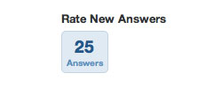
Quora recently added the option to "Rate New Answers" in a prominent place on the service's front page, to the right of the Q&A feed. When I visited this evening, I found 25 answers, which had not yet been rated by the community, waiting for an upvote or downvote from me.

Quora Reminds Me Why Rating Answers Is Good for Us All

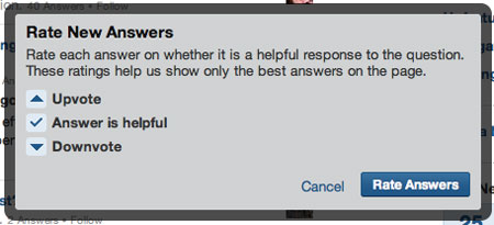
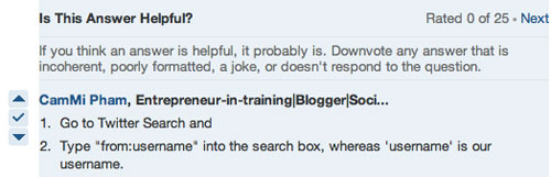
If you do click to rate new answers, Quora says you are doing your part to help the best answers be discovered. When one is rated, click Next to rate another, until your batch (my 25) are completed. Assuming a good amount of the population rates a solid number of answers, the likelihood that answers will lay fallow without any feedback will be dramatically reduced. If the quality of the upvoting and downvoting remains strong, it's another explicit signal that will help Quora maintain high value.

Getting Started With My Rating Process (and a Guide to Choose)

Keep in mind that while it may feel like community service, those you do upvote will be listed in your Quora site activity, so it's not exactly invisible. If you're someone who wants to keep your activity feed pristine, on topics you've sought out yourself, you might want to not participate, but that'd be a little OCD now, wouldn't it?

February 24, 2011

February 24, 2011 · 6 MIN READ · BY LOUIS GRAY

Windows Phone 7 is the Best Windows I've Ever Tried

Windows Phone 7 is the Best Windows I've Ever Tried

While I am typically skeptical when it comes to products from Microsoft, I am remarkably surprised by the great quality of Windows Phone 7. Over the last few days, I have been using an HTC HD7 device running Windows Phone 7 alongside my Android devices and occasional iPod Touch use, and without reservation, I believe the Windows Phone 7 experience to be a serious challenger to both platforms in terms of quality, intuitive use and simplicity - things you usually won't catch me saying about Microsoft, or Windows specifically.

As I wrote back in June, I am trying to offer true pragmatism in a world of fanboys - a real challenge, especially when it can be fun to debate platforms, operating systems or our favorite technology innovators. Like I did in that same month with my initial tests of Android and the HTC Evo, relative to my iPhone, I've put my primary phone aside for the most part in the last few days, using it only for phone calls and the occasional app I can't get on Windows Phone 7. Fair is fair after all.

A Windows Phone 7 Syncing With My Mac? Armageddon, Right?

What I've found is that Microsoft has delivered what is quite possibly the most innovative approach to the mobile phone interface since the advent of the first iPhone. While most Android and iOS products are best represented by screens of application icons, with the occasional folder or widget thrown in for good measure, Windows Phone 7 brings tiles for some of the most useful actions to the front of the device, such as phone, mail, Internet Explorer, the marketplace and People, which draws heavily from your Facebook account, if you connect the two (and you should). Beyond the first page of tiles, accessing all downloaded apps is a simple swipe to the left away, and you can add any app to the front page by long pressing and clicking "pin to start", keeping in line with Windows' traditional message of the Start Menu.

Contrary to Android's Wild West mentality in terms of applications, due to the device being an open system, Microsoft's user interface guidelines are seen everywhere. Every app elegantly fades in and out when open or closed, and you can swipe between different aspects of the app in what's known as the panorama. Every app presents a unified top-level font and sub-level fonts for lesser important items. When necessary, these apps too use the same tiles present on the start page of the device. What is lacking in creativity is more than made up for in each app behaving in the same way as expected, and a dramatic cutdown on the learning curve.

Desktop Syncing My iTunes and iPhoto to Windows Phone 7

Calling this phone OS Windows is pretty much a detriment to the device, in my view, thanks to that OS' history and associated baggage. Luckily, there is no such thing as a Start Menu in the traditional sense, no Windows Dock, and no obvious folder structure riddled with tie-ins to 1980s-era DOS. Without being too detrimental to Android, my current mobile OS of choice, one need only look at the crazy ways users are trying to upgrade their Samsung Epic devices to Froyo to understand how much work is needed on that end to get away from the geeks and more to the mainstream.

After a year or so of being on a cloud-oriented mobile OS, I was almost surprised with how easily the Windows Phone 7 device easily synced with my Mac and the relevant files. Forget about the Microsoft vs. Apple arguments of the past. I just downloaded the free Windows Phone 7 Connector for Mac, connected the device by the included USB cable, and immediately had access to my iTunes and iPhoto content on my HTC HD7. This alone is further than I've ever come with my Android phones, which to date have simply pushed content from photos I've taken back to the computer, and not bidirectionally. This doesn't change my view that yes, the Web will be the center for the mobile world going forward, but it is somewhat reassuring to know I can always go back to the PC (in this case a Mac) as the hub if needed. I'd like to see Google offer an equivalent desktop sync for Android users, even if it did nothing else but visually display how data was moving between the phone and the cloud.

The HTC HD7 Device I've Been Testing

Within minutes of turning on the Windows Phone 7 device and connecting to my home WiFi (on Apple Airport), I registered my first Live.com email address, and was able to browse the included Marketplace, which like iTunes and the Android Market, is separated into categories for easy browsing (HTC Apps, apps, games and music at the top level), and into top apps, new apps and free apps, much like its counterparts. This led me to discovering and downloading many apps for the device, starting with the basics like Seesmic, Twitter, Facebook, Foursquare, Stocks, the Weather Channel, YouTube and others. In each case, the apps behaved as expected, but with the simple Windows Phone 7 UI.

Where Windows Phone 7 is lacking thus far, as you can expect, is in the breadth of apps. So far, there is no Angry Birds (though that's been announced). There's no native client for Sonos or Spotify, which has me tapping into my local music library, and it's a little shy (so far) on top-quality games. That's no surprise given Microsoft's current position in the market, and relative newness of the platform, but if they can move beyond the initial reports of slow sales, there's a good quality environment for users in here. And yes, there's no copy/paste yet, or even screenshots. Too bad, or I'd show them here.

To be entirely fair, I haven't stress tested Windows' calling qualities and features as I did Android. In fact, I haven't even inserted the T-Mobile SIM card that came with the device, because I don't want to start a new number and new plan with yet another carrier. But even with simple WiFi access, I have been able to see how the device handles browsing the Web (quite well with Internet Explorer), the accuracy of its GPS, via Foursquare, and how well it handles e-mail and other social networking activity. The product's close ties to its Zune family also actually present a high quality music and video experience as well, which gets even better considering the bundling of a native Netflix app for Windows Phone 7 which means I can instantly stream anything from my queue right to the device.

When I switched to Android, I correctly forecast that Google's inroads with multiple manufacturers, carriers and eventual user growth would lead to more developers and higher quality applications. This has happened, and has steadily improved my experience on Android, including to tablets like the Samsung Galaxy Tab (which I own) and the Motorola Xoom, which debuted yesterday. What's interesting about the Windows Phone 7 experience is that there's no drop-off in quality from one OS to another. If forced, I could absolutely live within this device and not be too much worse for the wear. I'd miss quite a few apps today, and might find myself without the breadth of options available with Android, but make no mistake, this is the most pleasant device I have ever used that sports a Windows icon, and I am eager to see if Microsoft can overcome their rocky start in smartphones to be a real challenger. The more the merrier.

February 21, 2011

February 21, 2011 · 4 MIN READ · BY LOUIS GRAY

Real Valley Stories: E-Commerce Analyst or Black Hat SEO?

Real Valley Stories: E-Commerce Analyst or Black Hat SEO?

Editor's Note: Part two in an irregular series of stories from my 12 years in Silicon Valley. The first one was posted in December about my first interview at my first job.

E-Commerce Analyst or Black Hat SEO?

After years of reading about people like Steve Jobs, Larry Ellison and Bill Gates in books, newspapers and magazines, I had finally gotten a real job in Silicon Valley in 1998. Lacking a computer science background, but being HTML savvy enough to administer a small Web site, it was clear I'd be doing a lot of writing, with some coding. But in the Wild West mentality of the late 1990s, at a company with a grand total of three people, myself included, the actual job was something of a work in progress. The company had big aspirations - helping other businesses recognize the full potential of the Internet, and to gain a top Web presence, especially when it came to the new world of search engines, led by names including Alta Vista, Excite and Lycos.

Our first projects surrounded chronicling Silicon Valley History, ranking the top 100 computer magazines through our set of practically arbitrary rules, and one of our biggest tasks, looking at the top 100 technology companies, ranked by market capitalization, and then contrasting the way Wall Street measured them with the way the Web did. Our theory, which was both right and broken at the same time, was that the more links a company had to its domain in the search engines, the more highly the Web perceived them, and how well they would perform in the future, especially to a tech-crazy stock market excited about page views and future growth rather than present realities.

As we ranked companies both by traditional means and new methods, we came up with a new benchmark we hoped would take hold, called IVB (the Internet Valley Benchmark), with a derivative called the iFactor (its Web value divided by sales value). If a company held, for example, the #10 position for both market cap and Web ranking, its iFactor would be 1.0. The real fun came when a company would be much higher in one ranking versus another. For example, if a company with a market capitalization of $1 billion had a Web ranking that would put it in the position of a company that would have a $15 billion market cap when given the same ranking in financial terms, its iFactor would be 15.0. Conversely, the opposite result would be a piddly 0.07. Not great.

This sounds like silliness now, but at the time, it was surprisingly insightful. Apple, which has always had a high following online, with many links (due to QuickTime back then, mostly) scored with a 3.54. In contrast, Compaq, Dell and IBM, Web laggards at the time, were less than one, while Adobe, Symantec and Microsoft had very high scores (thanks to PDF, anti-virus and IE, respectively).

A 21-Year-Old Picking Stocks

In time, with the dotcom bubble in full swing, I Was asked to take this same data and use it to look at Web companies looking to go public. WIth a CNBC-addicted public, including myself on days I worked from home, and my boss (who often came into the office after market close, mid-afternoon Pacific), this became one of the most exciting parts of my odd role. And to be honest, the predictions were very good. I could look ahead at the week's five or ten planned Internet IPOs and hand-pick the best two or three, accurately forecasting which ones would spike to a solid market cap in the first few days, and which would flop. My reports were printed out and handed around the office, including to our sister company's employees, who ate them up like candy.

Thus, the title of e-commerce analyst. My boss had grown enamored with this title being bandied about on CNBC by proclaimed experts, so at age 21, holding no degree, I was starting my day with classes at UC Berkeley, and driving across the Bay Bridge to play Net trends guru.

In parallel, my boss had cooked up some intriguing Web marketing magic, which was dramatically successful at propelling our content to the top of the search engines of the day. Our tactics, including multiple domains linking to one another, white text links and keywords on white backgrounds, massive amounts of interstitial landing pages chock full of keywords to aid search engines along, are head-slappingly obvious violations of Google's SEO guidelines these days, but in the late 90's, without clear rules in place, it felt like the Wild West. It looked like magic, and we thought we could change companies' businesses by applying the same tricks to their own site.

IBM Would Pay Billions for This!

That's where the two tracks got mixed. If we believed strongly in the power of Web links and search engine rankings as forecasting future market cap and sales, then the thought was we could bring our software to the big giants of tech that lacked the Web's leading position. We hoped to take our magic to someone like IBM, promise to add on $1 or $5 billion to their market cap, and simply ask for a percentage of that increase. You know... a few million here or there for our efforts. Of course, this didn't sell very well, especially when third parties instead told us our software was probably worth closer to a hundred bucks than a hundred million. That will lead to our next story, when our fun little experiment got voted down faster than a last-minute makeshift volcano at a science fair.
February 21, 2011 · 4 MIN READ · BY LOUIS GRAY

Yobongo: The Open Chat Room In Your Pocket (Preview)

Yobongo: The Open Chat Room In Your Pocket (Preview)

In the four months since Yobongo first gained attention, CEO and co-founder Caleb Elston has been working to prepare his product for the visibility and scale potentially demanded by what's potentially the world's biggest tech event, SXSW, an environment which can catapult new sites into the stratosphere, or should they fall flat, have them forced to regroup. The service, currently in private beta on the iOS platform, has seen increasing activity at practically all hours, the equivalent of an open bar for discussion with members of the local community, which never closes.

In the last few weeks, I've finally found a reason to keep my iPod Touch nearby, in a home full of Android devices. The magnet-like pull is from Yobongo, whose goal is to bring people, potentially perfect strangers, who share a geographic location, together to talk about anything. The application's real-time nature, enabling true conversations between friends and others, goes beyond the world of serve and volley status updates or Q&A, putting the focus back onto the world of conversation instead of performance and counting of replies, retweets and likes. In fact, there are no points of feedback for updates - just a constant flow.


Yobongo in Action. Note notifiers for private messages, number of people chatting.


The concept hasn't changed since October, with the idea being people in shared spaces may discover they have common interests and can engage in intriguing discussions. For the many of us who routinely bump into the same faces and avatars on every network, this could be refreshing. Yes, just like any other social situation, it's easier to talk to those you know than those you don't, but Yobongo eases that process by mixing everyone in a single space.

So each morning, after turning off the iPod's alarm, I peek at Yobongo to find Caleb talking with users in the private beta. Some folks I know, and others I don't, but I am getting to know. And it's incredibly easy to jump into the stream of consciousness. For one, your avatar displays when you open the app, so they can welcome you. Second, the app doesn't start with a blank screen, but shows all the text flowing through the river - with the newest updates below. Should you want to, you can scroll up and see how the conversation evolved, see updates from people whom you may have missed, and get caught up.

Posting to the site couldn't be easier. There are no groups to join, as with other apps, some I like a lot (including Beluga and TextPlus). There are no demands to friend folks, as you're already connected to everyone live. And once you start typing, everybody knows because the system lightly says "... is typing." If more than one person is typing, the system updates there too. So you immediately, even in a small space like the iPod Touch, get an idea for all the participants, the ongoing messages, you can get updated on private conversations and see the thread as it evolves. Not bad.


An active Yobongo chat and a separate private message.


Caleb, previously highlighted on this site for his work with Toluu, Kallow and Kickpost, started the project with fellow Justin.TV ex-colleague David Kasper, who is responsible for engineering while Caleb handles product, the "yin and yang" of the operation as it stands now, he told me. While the company has been mentioned in the same breath as big group chat monoliths like GroupMe and others who have raised millions, Yobongo has not yet taken any funding. Lucky for them, they do have free residence at Dogpatch Labs, courtesy of Mike Hirschland and Ryan Spoon of Polaris Ventures, who would probably have the first in to a round A if Yobongo wanted to be YoFunded.

Like Quora, Facebook and other sites, Yobongo holds a few rules to help avoid abuse of the system. It's preferred that guests use real photos and use their real names. The app's short community guidelines ask to "be friendly", "be respectful" and "be authentic".

Does the world need yet another place to chat beyond the big social networks, and new places like Convore or the host of group messaging participants, including Beluga, GroupMe, MessageParty and TextPlus? It seems to me there is room for a lightweight system that doesn't feel like work, that is open to all who arrive, and leverages proximity. Whether Yobongo is the solution to an event like SXSW or not, only reaching those on iOS, remains to be seen, but I can see clear value to talking with both the friends you know, and the friends you don't yet know.

You can get in on Yobongo's private beta list by heading to http://www.yobongo.com. The service's first official intro video is below.